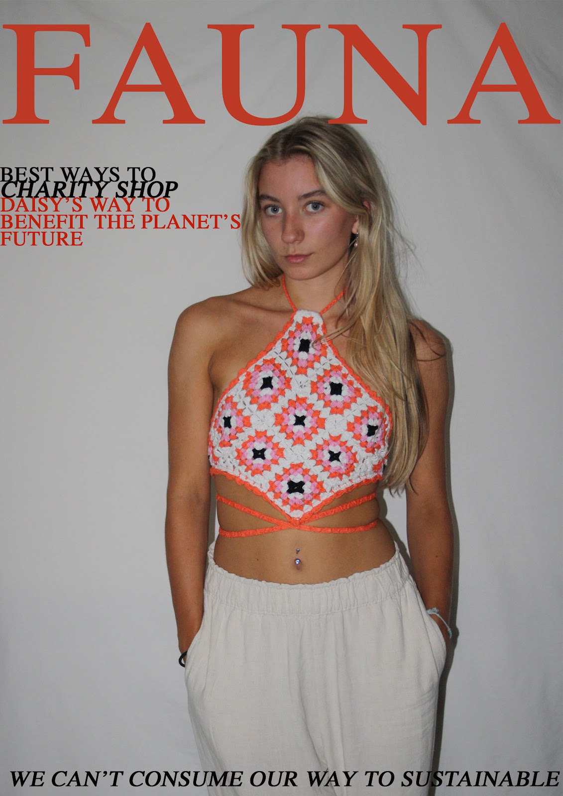
The two magazine editions both feature differing lifestyle.
Magazine 1 = Advancing sustainable living
Magazine 2 = Max's coming out story
Magazine 1
The mock up of Sofine's image was influenced by both the garments used in Ragged Priest photoshoots, and by rare sunglasses feature in magazines. Sunglasses are a rare feature located on magazine front covers due to the way they might be perceived and draw attention away from the model's facial features.
In the Eillish cover, a clear cut styling of the sunglasses matched with the outfit and model styling has been constructed to provide great authenticity and an enticing image for the audience.
The aubern/orange/beige's in the clothing and accessory tie in well - it works. The sunglasses don't detract attention from the main set out of the cover.
Even the green and black in the top third the image contrast the colour usage effectively. This has successfully built up a dynamic colour palette that subsequently reflects the representation and brand image the model (artist/ musician) wishes to convey to the audience.
This shoot with model, Sofine Bolter, allowed us to depict a variety of different poses and placements with the pinnacle being the sunglasses.The placement of the left arm tilting the sunglasses plays homage to the Vanity Fair, Billie Eillish cover. In the contact sheet above is the first photoshoot of Sofine, whereby we moved her positioning around to see what worked best. Styling with a prop comes with it's challenged because of the many considerations taken into account. For example, detracting the centre image off of facial features. One of the main influences for this photoshoot was from retail branded company - Ragged Priest.
Their photoshoots appear "quirky", "unique", "bold". They constantly subvert the typical retail shops marketing and advertisement. Whilst I don't agree with the manufacturing of their garments and their underlying fast fashion demeanour, it can be noted that their images are highly recognisable on multiple social media platforms and websites because it is what makes up their brand image.
Magazine 2
Whilst completing Max's photoshoot we decided to play homage to the famous flower scene in well-known coming-of-age film Clueless.

We moved the positioning of Max and the flower around to see which suited better. The side on images appeared much nicer than focusing straight forward. The centre aligned facing forward images almost appear awkward instead of comfortable. Now posing comes without saying of the tensing in posing and certain positioning, so it is hard to find a pose that truly works for both model and photographer.
Furthermore, when capturing my 'Max Collection' we looked over George Michael magazine front cover's for inspiration. George Michael was an idyllic advocate for the LGBTQ+ community during the late 80s/ early 90s. He was an influential role model of the time, especially considering the stigmas surrounding the gay community during this time. Whilst discussing with Max we decided to take influence from these front covers to show the attitude on his face - pouting.
The stern gaze into the camera lens in these front covers entices and engages and audience - "eye catching". The serious pouting and serious 'look' conveys an emotion which would be evident within the magazine content, perhaps displaying a serious issue or storyline.
We practiced a more "serious" approach.
These mid-shot/ close-ups reign in the focus on mainly Max's facial features. These structured shots benefitted the efficiency of the shoot because we were able to retrace what images 'worked' and which didn't. Capturing many images allowed me to browse through and see what posing/ postures 'worked' and furtherly being consciously-aware of how it would reflect mood/ meanings/ messages through a front cover, to successfully engage an 'audience'.


